


This might get me marked down because it’s not a podcast but I cannot stand hearing my voice because I hate my lisp. I digress…
I like to think that I have improved quite a substantially since doing the preliminary task. Just glancing over the college magazine I am almost questioning my level of taste.
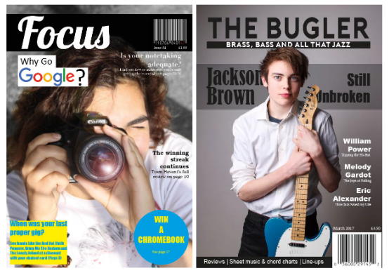
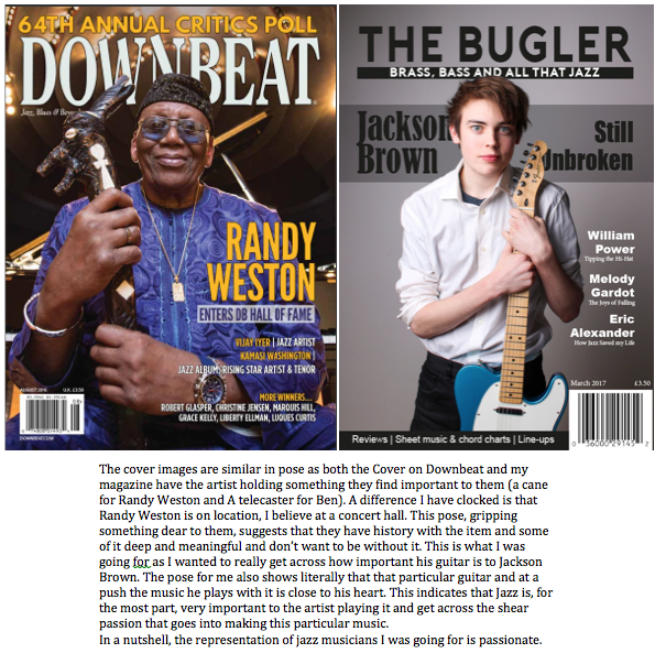
Just the cover photo makes my music magazine look so much more professional. The extra diegetic gaze makes the cover seem legitimate as it is the norm with most publications. The placement of cover lines is better with my music magazine as well. It seems a bit haphazard in my college magazine with there being a clear structure in my final cover.
Starting the year I had no idea how to use InDesign and I think it’s clear from the preliminary task. I had experience with Image Manipulation Programs but not Photoshop so the only real change to my photography was the location and lighting.
I have just learnt so much about the construction of a magazine: writing an article, taking the photographs, how to get the attention of a reader and so on. I’m happy with the final product and less happy with the preliminary task. At the time I thought it was good though.


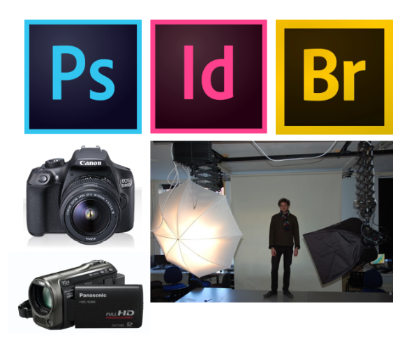
Over the course of… well… the course I have learnt how to use Adobe Software such as Bridge, InDesign and Photoshop. prior to media my only experience with image viewing were the numerous default image viewers from operating systems such as Microsoft office, ChromeOS and MacOS. Bridge changed this by allowing me to rate photographs making it easier to see which ones I am most likely to use. InDesign i found similar to Microsoft Office’s Publisher but with much more capability and a much nicer interface. I had used a similar program to photoshop in school but, again, the capability and the layout and way it operated was so much better and more professional. My photoshoot with Will (contents page) was the first time i had semi-professionally used my new camera, i had used a bridge camera and a point-and-shoot but not my DSLR. Previous DSLR experience was the photos taken for the preliminary task. It was also the first time I had used a lighting rig. It was quite a good feeling to take some decent looking portraits. I also hadn’t actually used a video camera before, just the video function on my phone and previous phones.
I have researched jazz magazines and their producers and for the most part they all seem to be a one off magazine. The only exclusion I can find is Maher Publications, which appears to exist solely to publish Downbeat magazine. As a result I would likely self publish and then distribute them in numerous local Jazz bars and music stores and then branch out from there. Examples of where I would ask to distribute my magazine are, The Concorde Club, The Jazz Café, Rosie’s Vineyard and potentially Ronnie Scotts. Though it is in London and therefore not local, it is a very well known jazz bar that has had some big names play there.
They would distribute it as it is fitting to the themes and representation that regulars have known and come to expect. Also if they have a jazz event coming up or just happened they would likely be able to get advertising in the magazine which benefits both partys.
As I would self publish I can only really suggest an big label such as Bauer. This could work as they have three music magazines but adding mine would allow them to diversify therefore attracting more people and increasing the lead they have.
The obvious Method of advertising would be somewhat crucial in early stages, as it would allow more issues to be printed. Adverts for music centers such as The Music Room, PMT or maybe PJ’s Guitar Centre or Jazz venues such as the ones I’ve mentioned previously would be a good place to start as they may be up for a deal such as they distribute the magazine for advertising.
The use of newer technology has presented more options of presenting news and they can do video interviews and potentially opens the door for interaction with the reader. Not only does it present new was of delivering news but it makes the magazines readily available to anyone with a smartphone, tablet or computer and internet access through services such as Readly and Issuu. As a result I would have my magazine on those services and ideally a website for video interviews or live sessions if I became somewhat successful.

Cover:
For the cover I changed the cover article’s title layout to really emphasize it as the main feature. For the change I took it into Photoshop and added a banner and a mask so the text appeared behind Ben’s head. the rest I dealt with in InDesign. I Changed the list of filler articles by shortening them and adding them to a banner at the bottom of the page next to the bar code. I also added a female name because equality in the arts and all that jazz. It also filled out the page a bit more and allowed me to have the other features alongside and somewhat contoured to the cover photo.
Contents:
I mostly left the Contents page alone I just changed the features column to accommodate the article on Melody Bardot as mentioned previously. I also added a picture next to the editor’s note as having a photograph of the editor seems to be common practice.
Double-Page Spread:
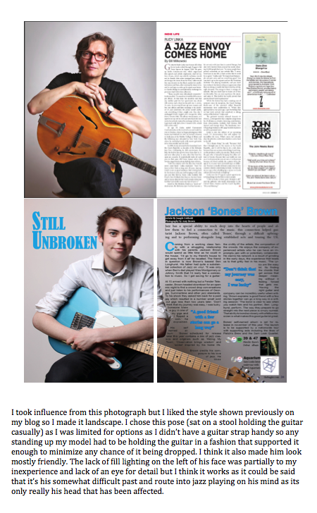
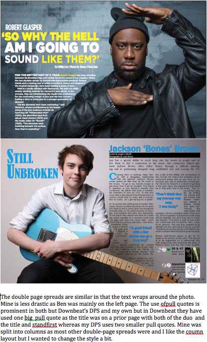
I went for something completely different here and I’m quite glad I did; I really like it. I took a landscape photo I liked, used Photoshop to get rid of any blemishes on Ben and cropped it down then in InDesign I split the copy into two columns and shaped the text boxes to match with the image (going around his elbow and declining with the guitar neck). I chose the blue for the title, drop cap, pull quotes and banner to match the guitar and I gave it a deep blue outline as it made it easier to read.
Cover:
This is the first iteration of the cover and I’m quite happy with it. I noticed when researching that the less important features were just single or double lines just placed in the available space. Barcode placement was always in a bottom corner, typically left. I put mine in the bottom right because it was appropriate and available. My sell line is ‘Brass, Bass and all that Jazz’. i came up with this after just saying all that jazz in conversation and then i thought of some key instruments in jazz. I settled with Brass and Bass because of the alliteration.
Contents:
All I’ve really done here is widen the bar to the width of the page in order and change the font colour to make it legible. I’ve also filled in the ‘Regulars’ with sections i found fitting after looking at numerous issues of Downbeat, JazzED and a few others. i got rid of the advertisement because one of my teachers said that i wasn’t required to do another page and that i should make my own if i were to put an advertisement, not just use an existing one.
DPS:
The changes here revolve mainly around the stand first and the title. I credits to the top left of the photograph. I left them white to make them not stand out too much but make them easy enough to read. The banner hasn’t itself changed it’s just been utilised better. I increased the size the title and the artist’s name and moved the name in the available apace after changing the layout and placement of the stand first. i have also changed the mentioned artist box. instead of saying where the albums are available I put the logo of the service where you can listen (CD, Apple Music, Spotify).
")

")
